
To comply with my non-disclosure agreement, I have changed some quantitative data and omitted some information in this case study. All information in this case study is my own and does not necessarily reflect the views of InstaHub.
Product
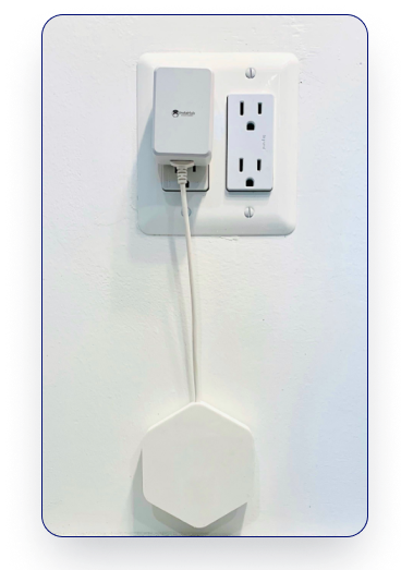
InstaHub is a B2B electronic company that helps in the AUTOMATED DETECTION OF ENERGY WASTE PATTERNS IN BUILDINGS using a multi-sensor data logger.
To create an intuitive dashboard for Instahub showcasing key performance indicators (KPIs), trends, and actionable data at a glance
Objective
Following the redesign, users experienced a substantial improvement in their ability to monitor and manage energy consumption.
The new intuitive layout and enhanced visualizations led to a 50% increase in user satisfaction and productivity and a 30% increase in click rate.
This transformation not only optimized operational efficiency but also significantly advanced clients' sustainability initiatives, reinforcing their commitment to a greener future.
Impact
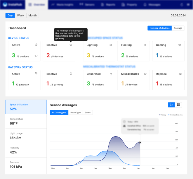

The dashboard of the product is designed to offer users an intuitive experience, boasting features such as Energy Consumption Analytics and a Datalogger, among others.
Context
The existing energy dashboard suffered from a cluttered interface and lacked real-time data visualization.
Problem
DISCOVER -> CONCEPTUALISE -> DESIGN
Lack of understanding of technical specifications and user expectations
Current frustrations and pain points?
What are the technical expectations?
What are the expectations of stakeholders and the business?
Discovering Requirements
Stakeholder Interviews:
I began by conducting interviews with InstaHub stakeholders, to understand the need for redesign. These interviews revealed the need for:
Reduce time spent on data monitoring and analysis
Actionable insights and alerts tailored to specific business needs and roles
Stakeholders expressed the need for a scalable dashboard
User Interviews:
I conducted in-depth interviews with users, including energy managers, facility operators, and sustainability officers. These interviews revealed the need for:
Real-time visualization of energy consumption
Personalization to allow users to focus on data most relevant to them
A user-friendly interface for quick and easy insights
Market Analysis:
To identify best practices and areas for improvement, I conducted a market analysis of existing energy management tools. This analysis highlighted the importance of:
A clean, uncluttered layout that avoids overwhelming the user
Effective use of color coding to differentiate various data types.
Integration of detailed drill-down capabilities accessible from the overview page.
DISCOVER -> CONCEPTUALISE -> DESIGN
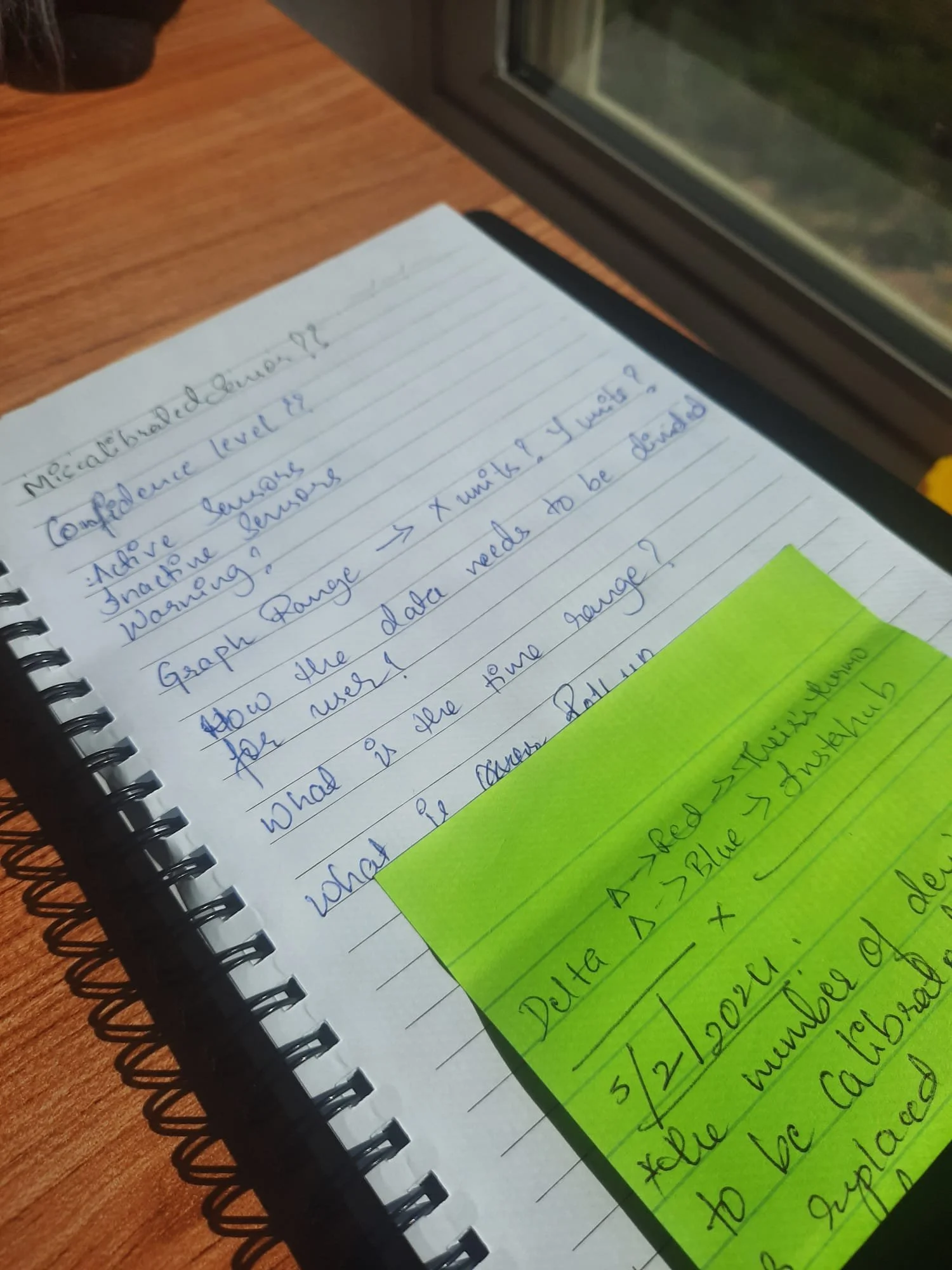
Overwhelmed by data, I needed to start prioritizing to develop a strategy
Understand what to display
Understand the feasibility of technical data
Incorporate new and old features
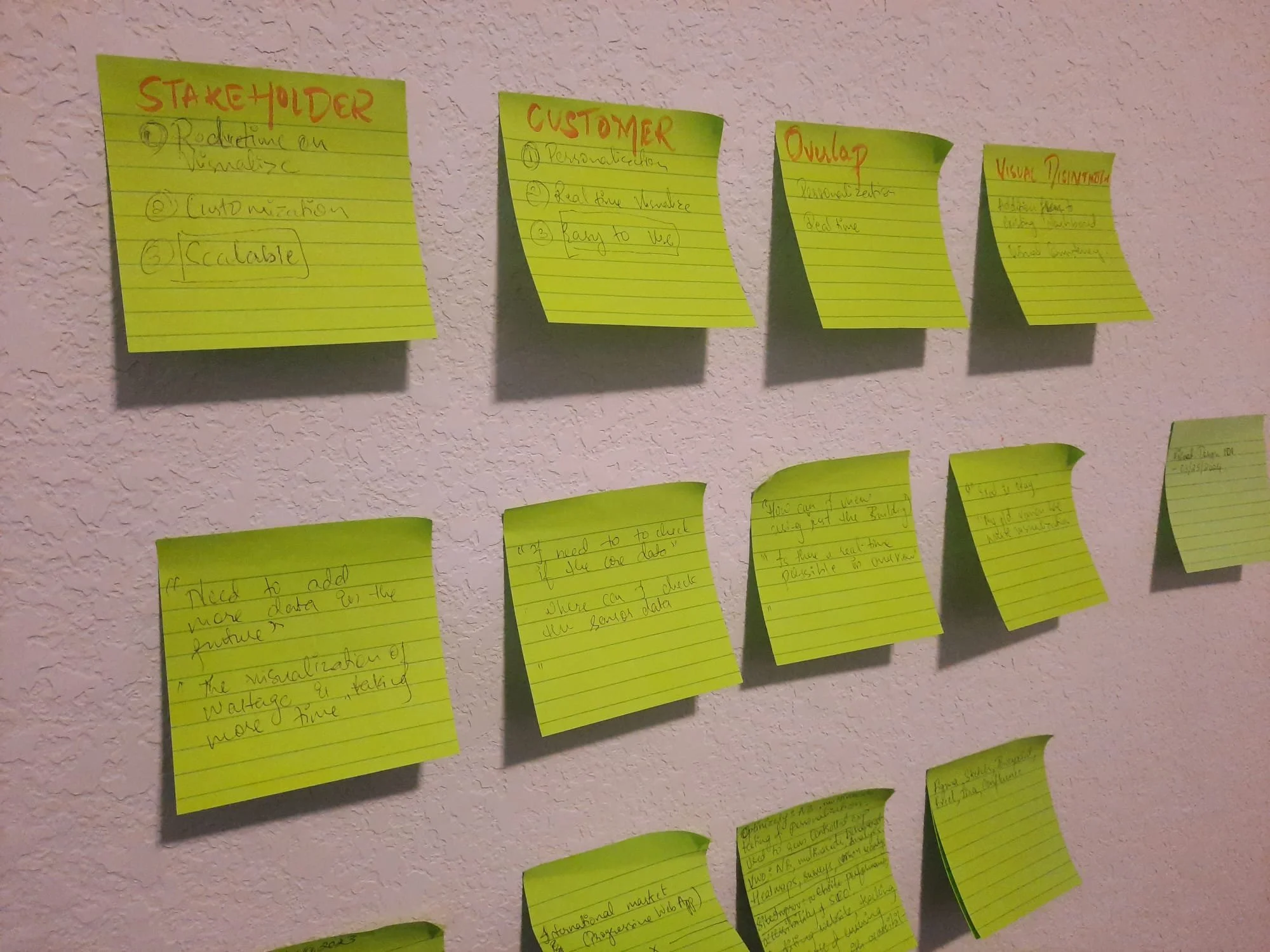
Affinity map
Affinity mapping helped in analyzing the interviews, allowing me to effectively highlight the needs of stakeholders, users, and any unique requirements,
Need for customization
Real-time monitoring
Effortless data slicing and dicing
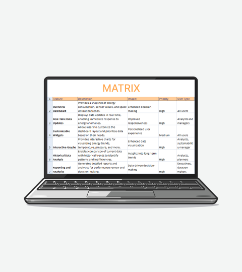
Feature matrix
The feature matrix was crucial in evaluating and organizing potential features, helping me prioritize based on stakeholder needs, user preferences, and project requirements,
Enhanced Data Visualization and Analysis
User-Centric Approach
Integration Capabilities through dev team
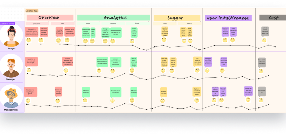
Customer journey mapping
The feature matrix played a key role in creating the customer journey map. By highlighting the prioritized features, the journey map was tailored to meet the needs of analysts, managers, and stakeholders, ensuring that their specific requirements were addressed throughout the process,
Different data visualization methods
Catering to both primary and secondary users
Filling the gaps from existing design
DISCOVER -> CONCEPTUALISE -> DESIGN
Sensors
Scalability issues to add numerous devices, which risked overwhelming the interface.
Implemented visual elements like dropdown menus for history, allowing users to easily navigate and manage large amounts of data without cluttering the interface.Unexpected stakeholder requirements at the end of the project
Handled through rapid A/B testing and real-time prototypingInfinite iteration loop
Rapid prototyping with the team to be on the same page with the team
Overview
Color coding inconsistencies and lack of standards created confusion
Established a clear color coding system ensuring that colors were used consistently across the dashboard to enhance clarity.The challenge of visualizing excessive information threatened to overwhelm users
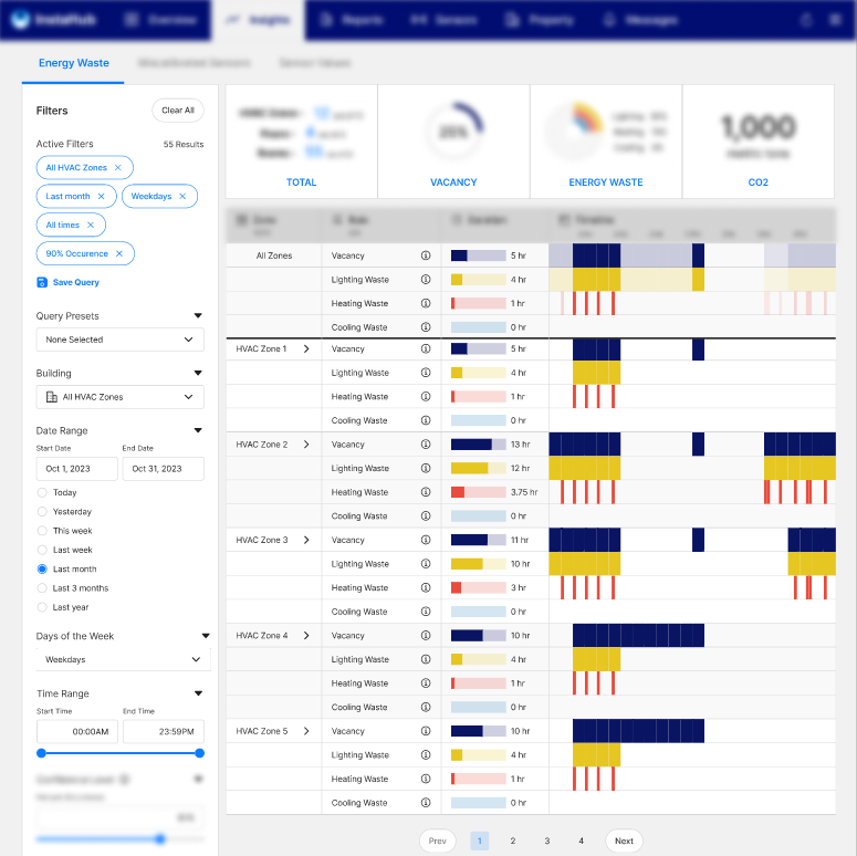
utilized insights from interview data to prioritize and structure the most relevant informationCustomization and interactive elements
Customization and interactivity issues were addressed by incorporating tooltips and improving information architecture (IA).
Energy Analytics
Macro to micro information
Visualize macro information through summary and micro information through numbers and graphsLess Cognitive load
Match the system and the real-world elements in the dashboard to easily comprehend the informationCatering to every user
The customer journey mapping helped to create a dashboard catering to every user
Learnings
Learning a New Domain:
Gaining proficiency in a new domain taught me the importance of thorough research and continuous learning. By immersing myself in the field, I developed a deeper understanding of user needs and industry standards, which allowed me to design more relevant and effective solutions.
Effective Collaboration with the Development Team:
Working closely with the development team underscored the value of clear communication and mutual respect. This collaboration improved our ability to align on project goals, address technical constraints, and deliver a cohesive product that met both user and business requirements.
Adapting to Changes:
Adapting to changes in project scope or requirements highlighted the need for flexibility and a proactive approach. Embracing changes as opportunities rather than obstacles allowed me to remain agile, adjust designs as needed, and ensure that the final product continuously met evolving user and stakeholder needs.